Info
21072210586

esPattio

Our lives and our work are increasingly linked and we seek comfort, to stay connected, to be more productive, to let ideas flow better. We need places that inspire us and have a positive impact on our creativity, the way we collaborate, our health...

Forma 5, a leader in office furniture design, launched a competition that brought together the best national branding consultancies after coming to the conclusion that, to embrace this trend, it needed to develop a new brand that would allow it to use its international establishment in a new light and with a new impetus.

intro 01 thumb pattio
cabecera foto coleccion pattio bika
04 thumb intro pattio
intro thumb pattio 02

Driving a new global trend in the furniture sector from Seville.

Its experience in the sector had already led Forma 5 to introduce references closer to "soft-seating" in its catalogue. Pieces that meet the contemporary needs of workspaces, but with a much more colourful and inspiring vision, where technology is diluted with forms closer to the comfort of a home.

What was clear to Forma 5 was that, for this new brand, it had to highlight its difference by expressing the brand's local inspiration with a vision that would also work globally. A very distinctive and recognisable but universal language that would make it clear what makes them different.

inspiracion pattio 04 sur
01 sur inspiracion pattio
pattio 02 inspiracion sur
inspiracion pattio sur 03

Our immersion in the world of soft seating, in the rich and inspirational universe that surrounded that South, as well as our first sketches and approaches to brand architecture, finally made us the studio that would share this exciting new venture with Forma 5.

The first step was to investigate and decide on the register with which we were going to draw that South, a purely inspirational exercise with which we were filled with stimuli. To focus on the territory from which we would convey the difference and potential of the new brand. We were clear that we would avoid the use of clichés or conventionalisms "in a Southern key" to achieve that connection with our audience, fleeing from the obvious to dig into the essence. And we did this by taking into account different points of view such as the vernacular architecture of Rudofsky or the light of Campo Baeza, the new ceramics being made in the South, all those spaces capable of creating atmospheres and those brands with design as the backbone, such as Teenage Engineering.

1 2abam_1211
01 inspiracion thumbs pattio
thumbs inspiracion 02 pattio
pattio thumbs inspiracion 03
pattio 04 inspiracion thumbs

Once the scent of what was to be portrayed was "drawn", it was time to provide the new brand with solid tools and foundations. To do this, we built a strategy that would make an impact on our audience by conveying the difference, potential and vision of the new workspace that the new brand has at its core.

To do this, it was essential to shape the brand purpose, its values and the storytelling that outlines its framework for action. A joint work with the Forma 5 team with which we managed to extract all the elements that had to be in the future construction and architecture of the brand.

"A human, sensitive design with its own identity to create warm, comfortable and versatile spaces that turn into welcoming rooms, we want to subtly transmit our essence of the South through a transversal and inspired look. Because it is time to humanise, also the workspaces, with purity and sensuality as well as precision and care, thanks to the strength that design gives us"

Inhabiting workspaces

We promote a humanist revolution in the workplace, bringing shared spaces to life, making us inhabitants rather than workers. We are committed to a new workspace: human, contemporary and inclusive, in which meeting together is more motivating and more fruitful.

We want to design furniture that makes us more people, recover conversations, promote encounters that leave a mark.

We want to inspire workspaces, to turn them into vital spaces in which to bring our light, colour and warmth to everyday professional life.

habitamoslosespacios pattio estrategia
thumbs 02 1 luzcolorcalor pattio
thumbs pattio luzcolorcalor 01
thumbs luzcolorcalor 03 pattio
luzcolorcalor pattio 04 thumbs

It is time to give all this a name. The name. A brand name that would contain all these concepts and values, that would transmit light, air, water, peace, relaxation, warmth, colour, personality, and would symbolise this unique architecture, the art that Andalusia conveys from a universal and contemporary point of view:

pattio imagen nombre

A naming that reflects this binomial and mixture between life and the echo of the heart of the houses of the South, where the neighbourhood lives together and shares like the workers and departments of an office to enrich looks and thoughts. A lively and flexible place that lends itself to socialising and cooperation between people, where to receive, celebrate and recharge. A nerve centre that envelops and welcomes, where voices, ideas and projects coexist and fill the open space with stimuli. A name for a way of working that resembles a way of living.

pattio logo cuero

Pattio has a special colour

After building all the foundations on which the brand would be based, we gave shape to the most visual part of the brand. The universe and the language that would support messages, catalogues, the brand's digital ecosystem... From the clear premise of building a very sensorial universe, like the brand's product and the true treasures of the South, without artifice or complexity, made up of few elements that would draw a clear, enjoyable and understandable system for anyone who approached Pattio.

sevilla albero amarillo
muebles colores pattio
nombres tipografi_a pattio

Working along the lines of the visual universe, we knew that an important resource for any furniture brand would be photo shoots and scenarios built with CGI tools. Portraying the product was the need to be solved and also to subtly give these images that southern flavour that permeated the brand in a transversal way.

To do this, we rolled up our sleeves and, by plane, we went to work in the field. We wanted to see, touch and feel in order to make the decisions we had already taken in the more narrative and design aspects. The visual world also needed to be seen with our own eyes, so the whole team travelled to the South to carry out a real location exercise and surround not only each of the pieces but also the entire brand universe with the essence that had given birth to it.

After that first visit, he went back to sketching. Ideas, images, smells, flavours and colours became clearer and clearer, which allowed us to generate a rough idea of what we wanted to say and, above all, how we wanted to say it.

03 bocetos pattio
pattio imagenes 02
05 imagenes pattio
pattio 03 imagenes
01 imagenes pattio
pattio 02 bocetos
imagenes 04 pattio

Con la idea clara de lo que necesitábamos, las primeras grandes maquetas y con todo el equipo conectado con cada una de las necesidades, llegó el gran viaje. Las sesiones de fotos de producto se produjeron en enclaves estratégicos en Sevilla y Cádiz. Siete días para conseguir que la luz, el ambiente y las texturas de las imágenes nos conectaran con el mundo que se quería dibujar para trasladar el potencial de Pattio al mercado del mobiliario de oficina. Todo un equipo, de Norte a Sur, para darle forma y vida,

imagenes 02 pattio makingoff
05 pattio imagenes makingoff
imagenes pattio 04 makingoff
pattio makingoff imagenes 03
pattio 01 makingoff imagenes

We worked together with the client to get all the materials and shape the brand launch plan. In the midst of the global pandemic, thinking about trade fairs and physical presentations seemed a thing of the past, so we shaped a plan to launch small pills to the market and materials to present the brand virtually, shaping the first materials that would transfer the brand to customers and prescribers.

presentacion pattio 01 portatil
rrss iphone 01 pattio

Giving shape to the commercial tools in the form of catalogues, monographs and presentations was important in order to support the Forma 5 discourse and to be able to present Pattio to the world. In them we collected the most important contents of the strategy, giving shape to very editorial, magazine-type materials, where we connected directly in the form of interviews, sketches and soul with the backbone of the brand: design.

pattio pattio portada
portadas pattio 01 monogra_ficos
interior catalogo 01 pattio

The digital ecosystem of any brand is important if you are a brand with an international vocation like Pattio, and even more so in these times when physical relocations are more complicated. We gave shape to a website for the brand that captures all its essence, full of resources and tools so that clients and prescribers could perceive the platform as their main tool for working with Pattio. In addition, we gave a lot of strength and importance to the momentum and reach of social networks, with a very measured content strategy that launched small clues and drips until its final presentation.

01 web pattio
pattio web 02

Teamwork is dreamwork

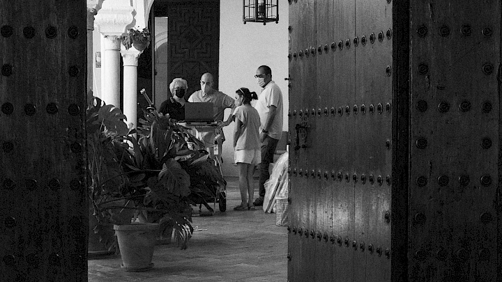
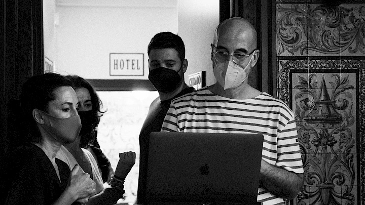
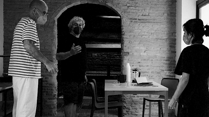
Processes like this, of deep branding work with firms with an important commercial establishment, international and where design is a core lever to connect with their audience, require all the expertise of -move and to surround oneself with the best team. Starting from a very close work with the client, who is always the best connoisseur of his audience, it is important to start building. To this end, we were in constant contact with the most important representatives of Forma 5's management, design and commercial department.

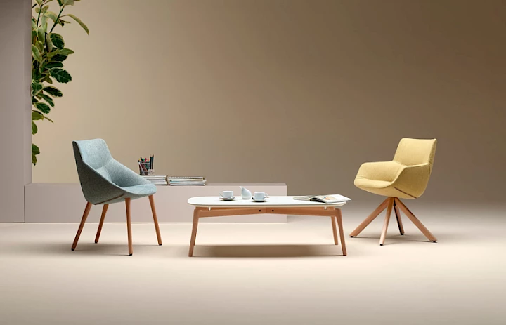
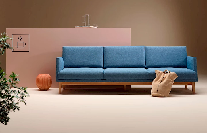
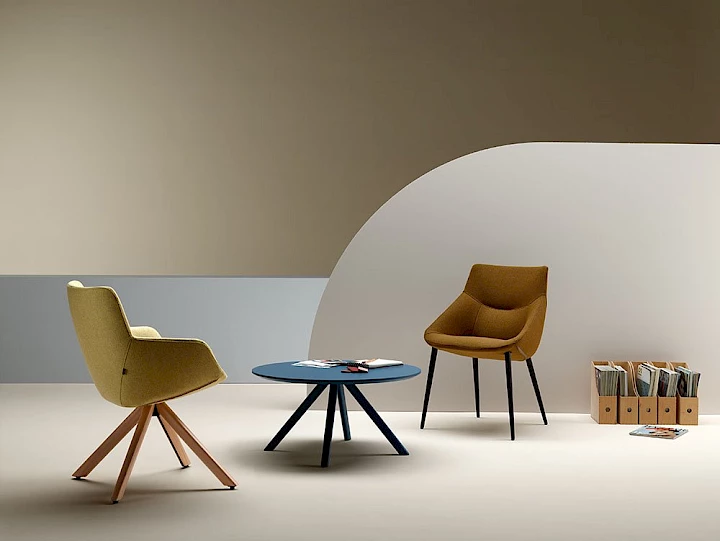
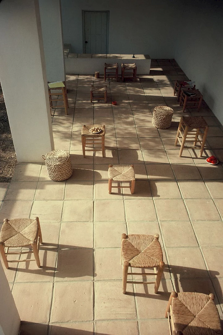
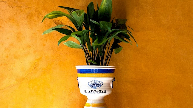
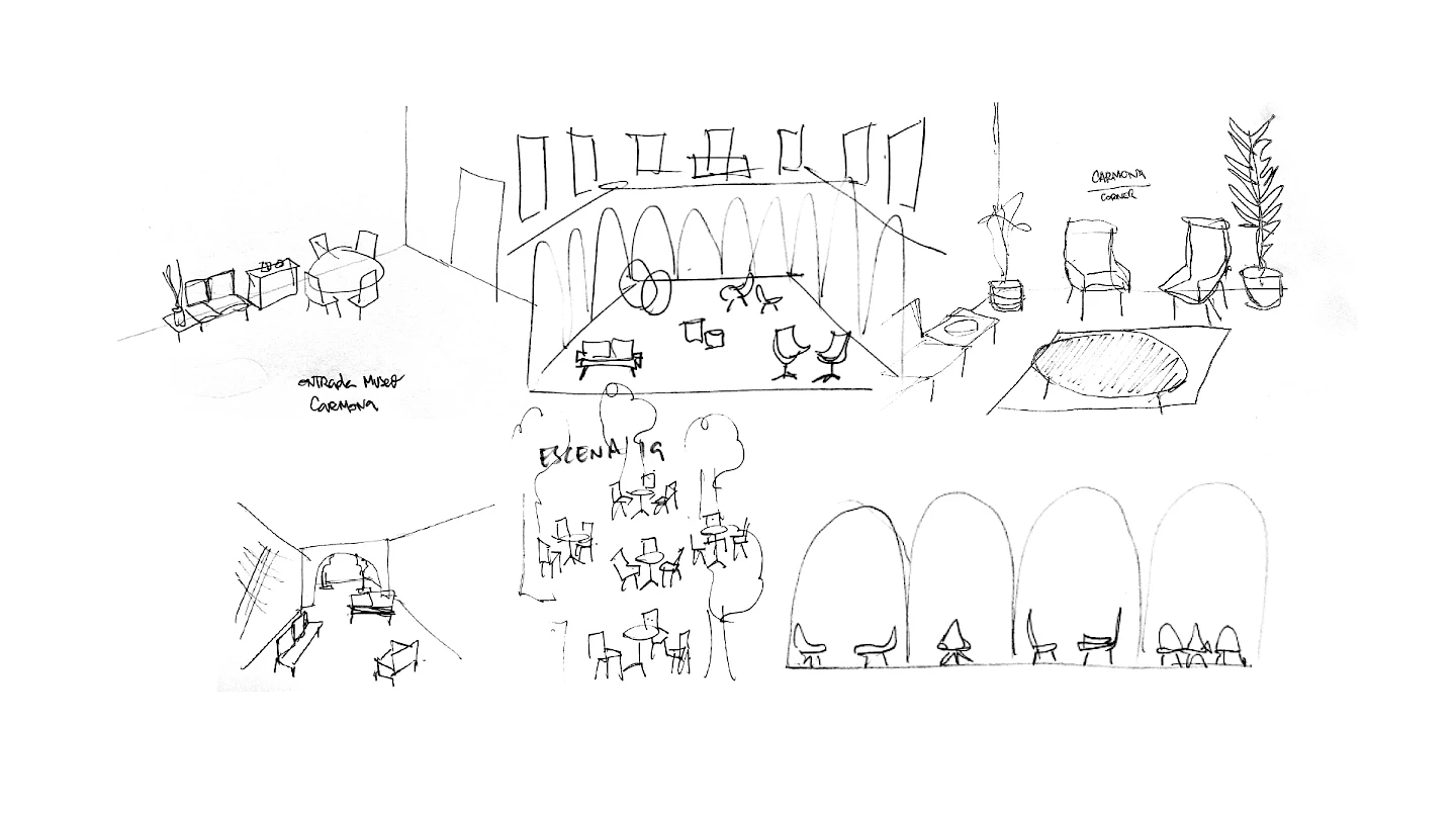
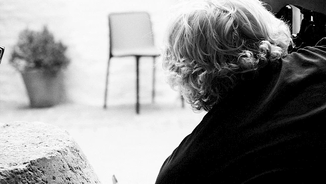
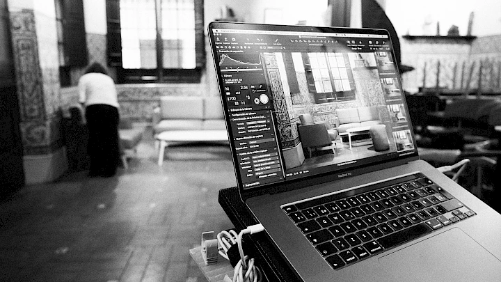
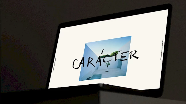
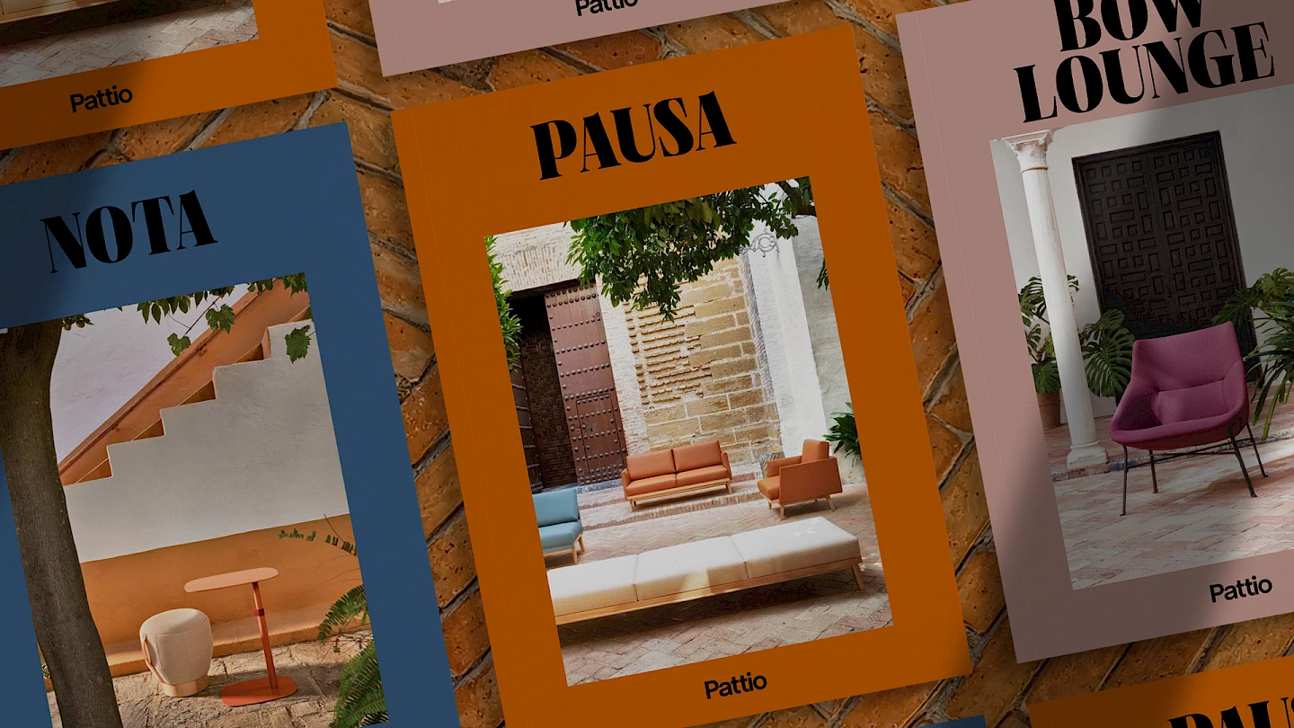
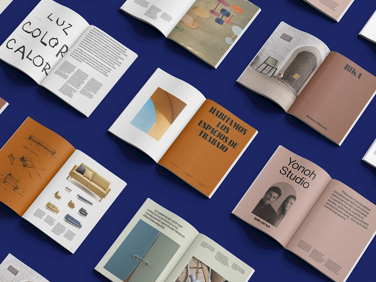
From -move, directing the work of artistic direction and execution of the project, we had professional support with whom we built a working atmosphere typical of the malecón of Cádiz! For the whole inspiration phase we have the collaboration of Xabier Zirikian, an expert in giving shape to ideas and atmospheres and one of the founders of the renowned brand Loreak Mendian. In the field of image production, we collaborated with the interior designers Fernando Iriarte and Cristina Álvarez de Eulate and one of our main photographers, Pepelu López de Zubiria, who helped us to build the scenarios and shape the production plan for the sessions, a critical task in order to build the brand's universe. A work that we completed with the 3D images of Kimu Studio with which we managed to visually "lift" the whole essence of the brand.

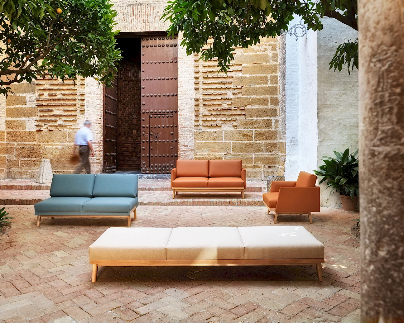
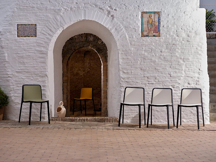
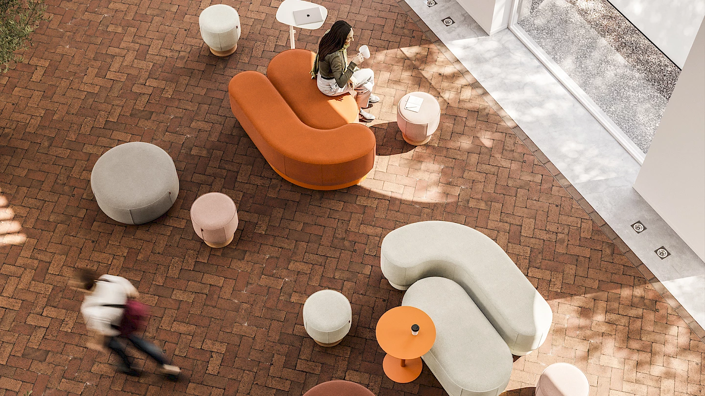
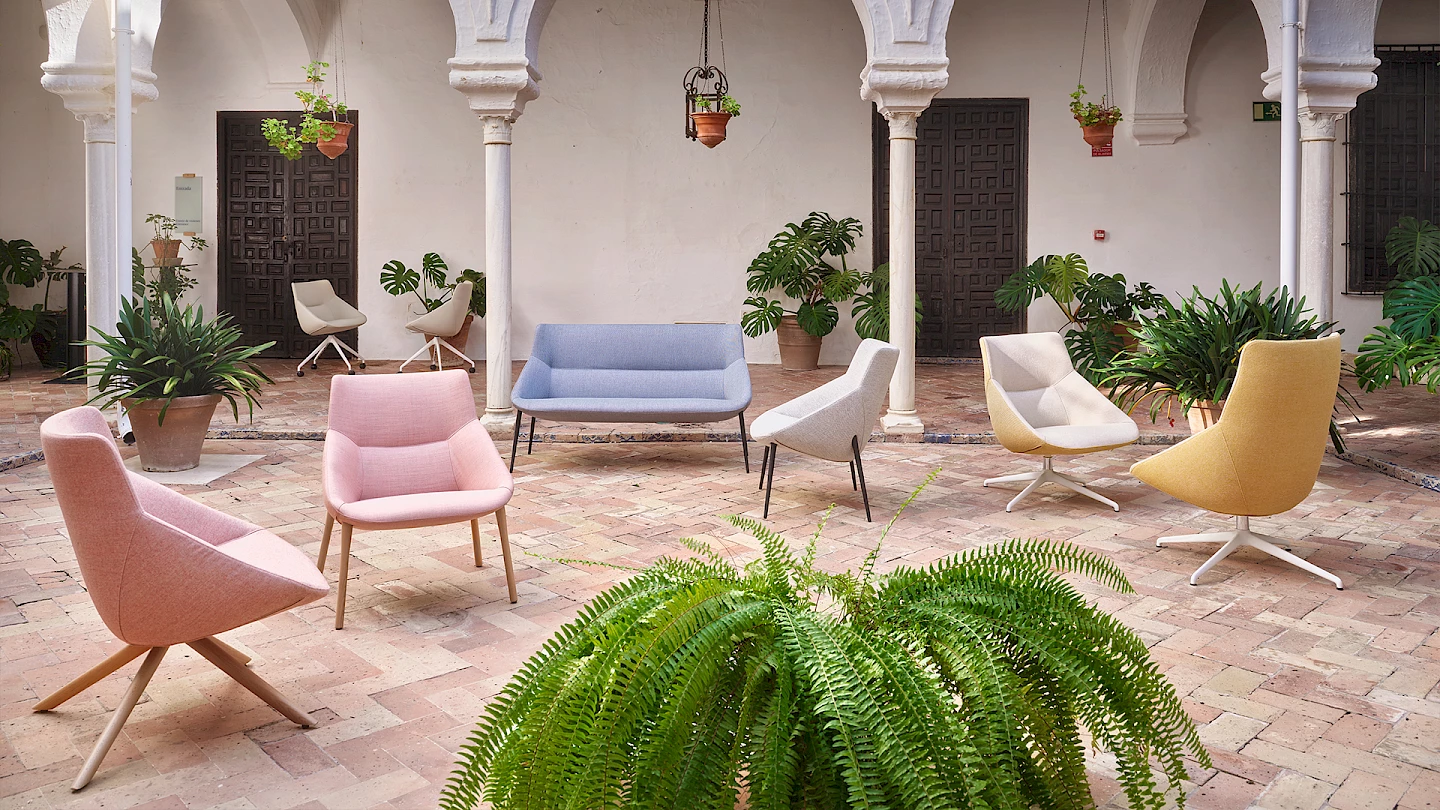
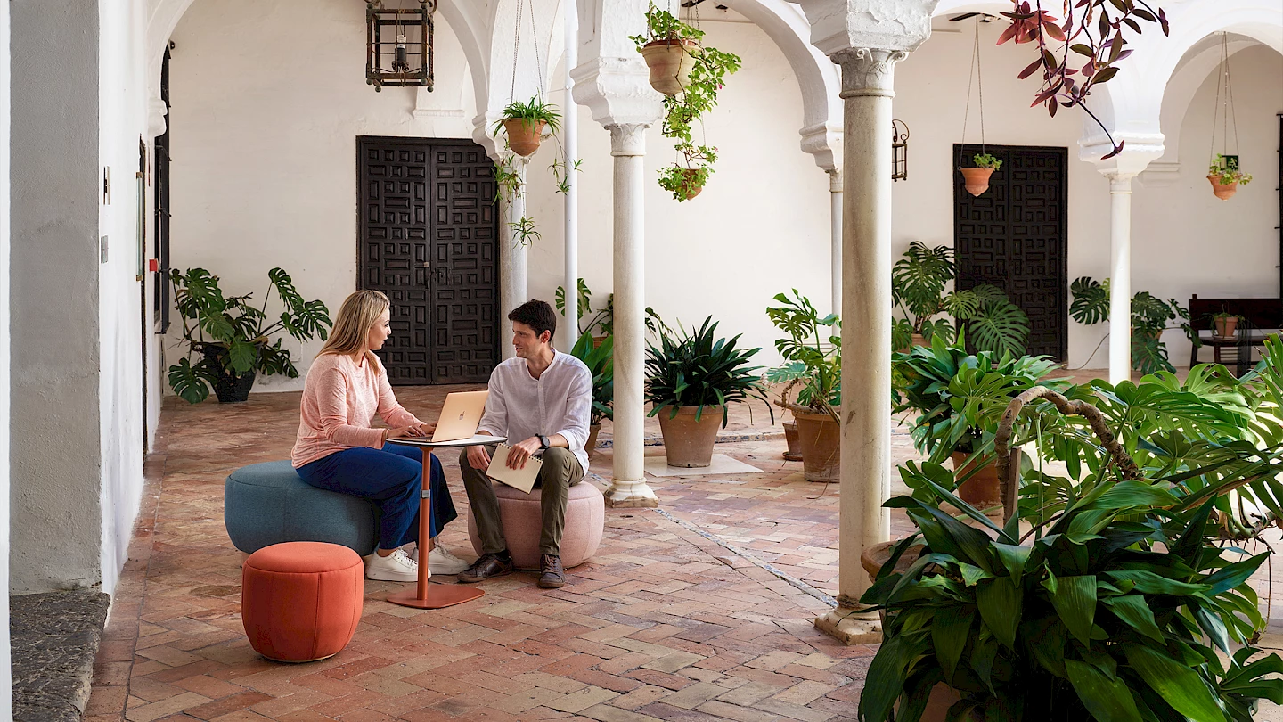
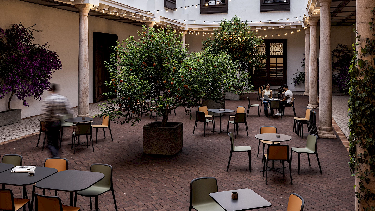
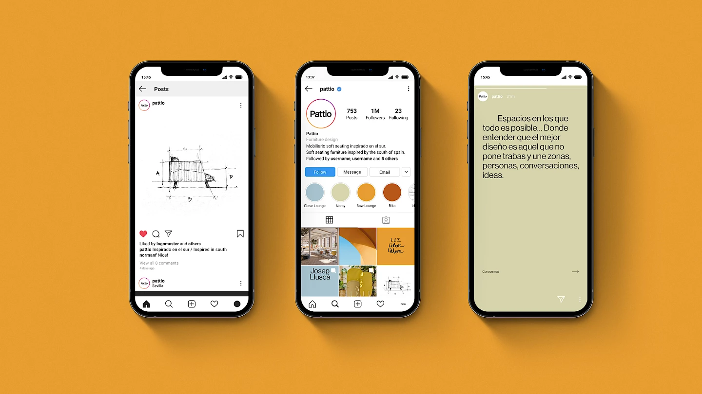
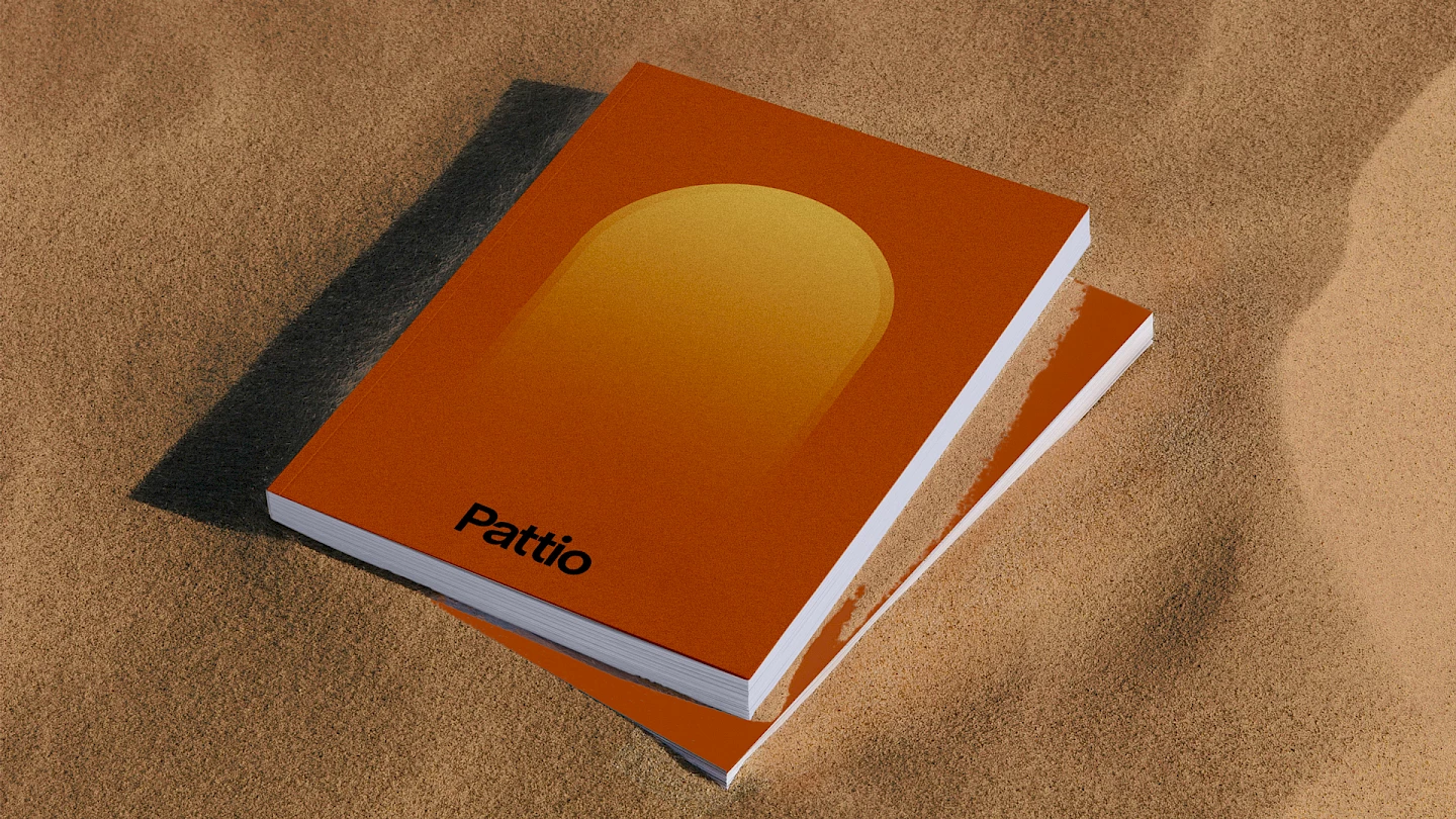
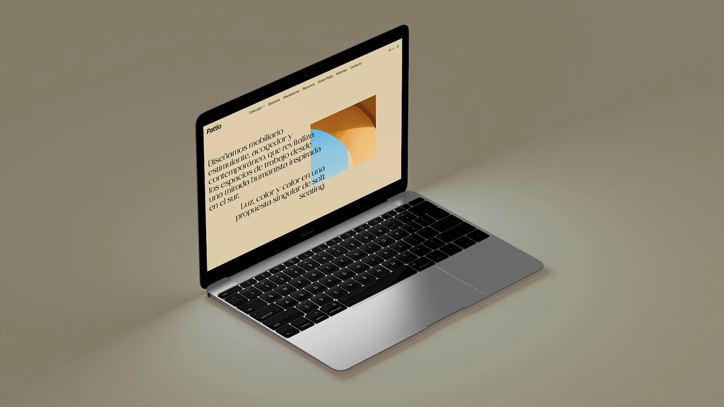
A brand, Pattio, which is already operating at full capacity in markets as diverse as Europe, America and Asia. A difference that we wanted to portray and that is having an excellent reception in the sector, driving Pattio to open business in other sectors such as hospitality or hotels.