Info
cabecera

Almetac

When a brand has such solid values, strong convictions and a long history of consistency, the task of tackling a repositioning and rebranding project becomes a very satisfying task.

Almetac is a company that produces and distributes different types of glues and adhesives. A medium-sized firm but with great particularities that make it different. And, being aware of the value of that difference, Almetac set us the challenge of identifying it, verbalising it and giving it a new entity that spreads to everything the brand projects.

almetac bn slide 01
bn almetac 02 slide
03 almetac bn slide
slide bn 04 almetac
bn almetac 05 slide
bn almetac slide 06

Building on solid foundations

We approached the new stage of Almetac from the foundations, from the base and reflection, with the aim of (re)discovering the essence of the brand, trying to delve into everything that makes it express more and better what it really is.

Throughout the coworking process, we discovered the solidity of these pillars: a strong commitment to product research, a great capacity to anticipate and adapt to change, and above all, a spirit of closeness and commitment to each of its customers on which Almetac bases its business strategy and which it was necessary to make tangible.

almetac_1
stick calm 1 etiquetadora almetac

A new brand dimension. A new motivation.

Starting from the conceptual base, from the discovery of the brand's essence, the challenge was to transfer it to a new visual identity, a new graphic expression of the brand capable of transmitting what Almetac is proud of: the strength of a renewed and modern brand, but sustained by its history and the trust of its customers.

A renewal that fills with motivation and new energy a team of people ready to face new challenges.

The new brand conveys solidity, strength and a strong presence in the face of its competitors. A minimalist language of pure lines that evokes the pragmatism of a well-done teamwork.

Almetac's colour is its sign of identity, it is what differentiates it from the rest. Almetac is green, with all the connotations that the colour itself entails. It is related to calmness, a close colour. It is the colour of growth, renewal, kindness and security.

logo almetac proceso
02 color corporativa2 almetac tipografia
01 almetac corporativa color tipografia

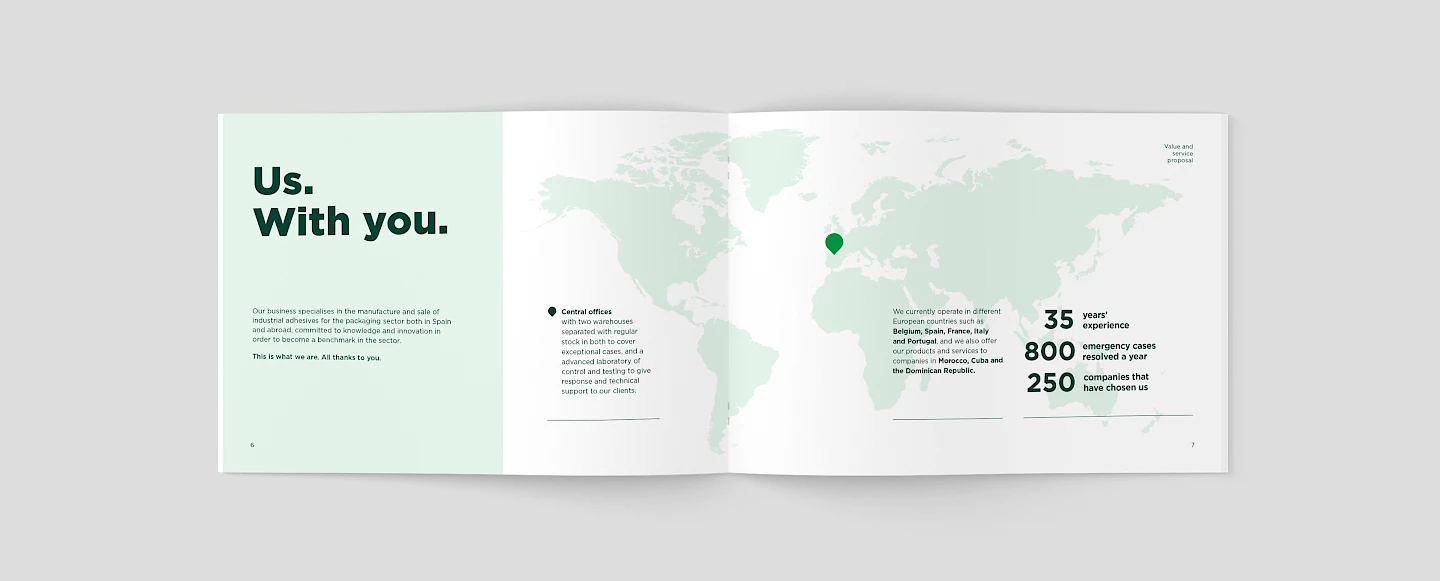
Projecting into new markets and new challenges

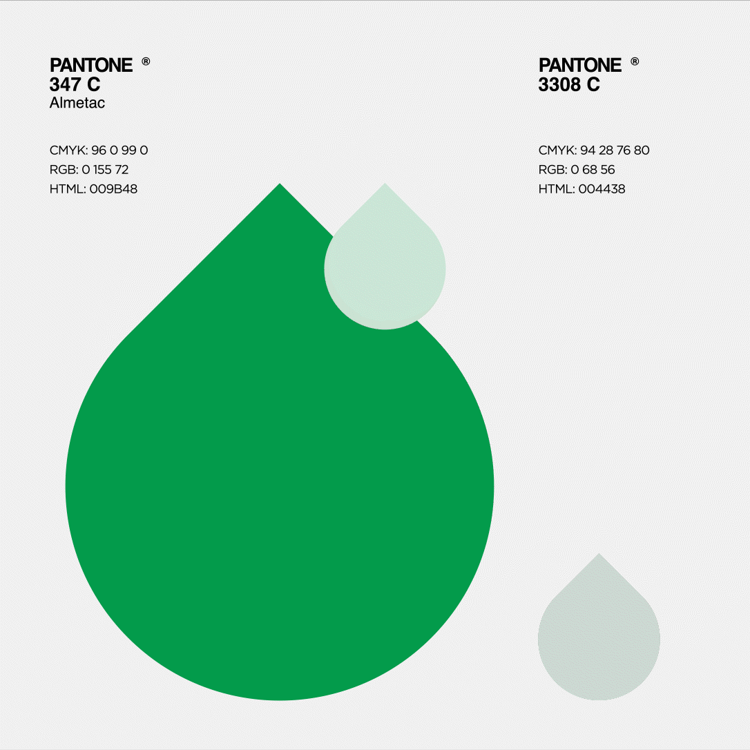
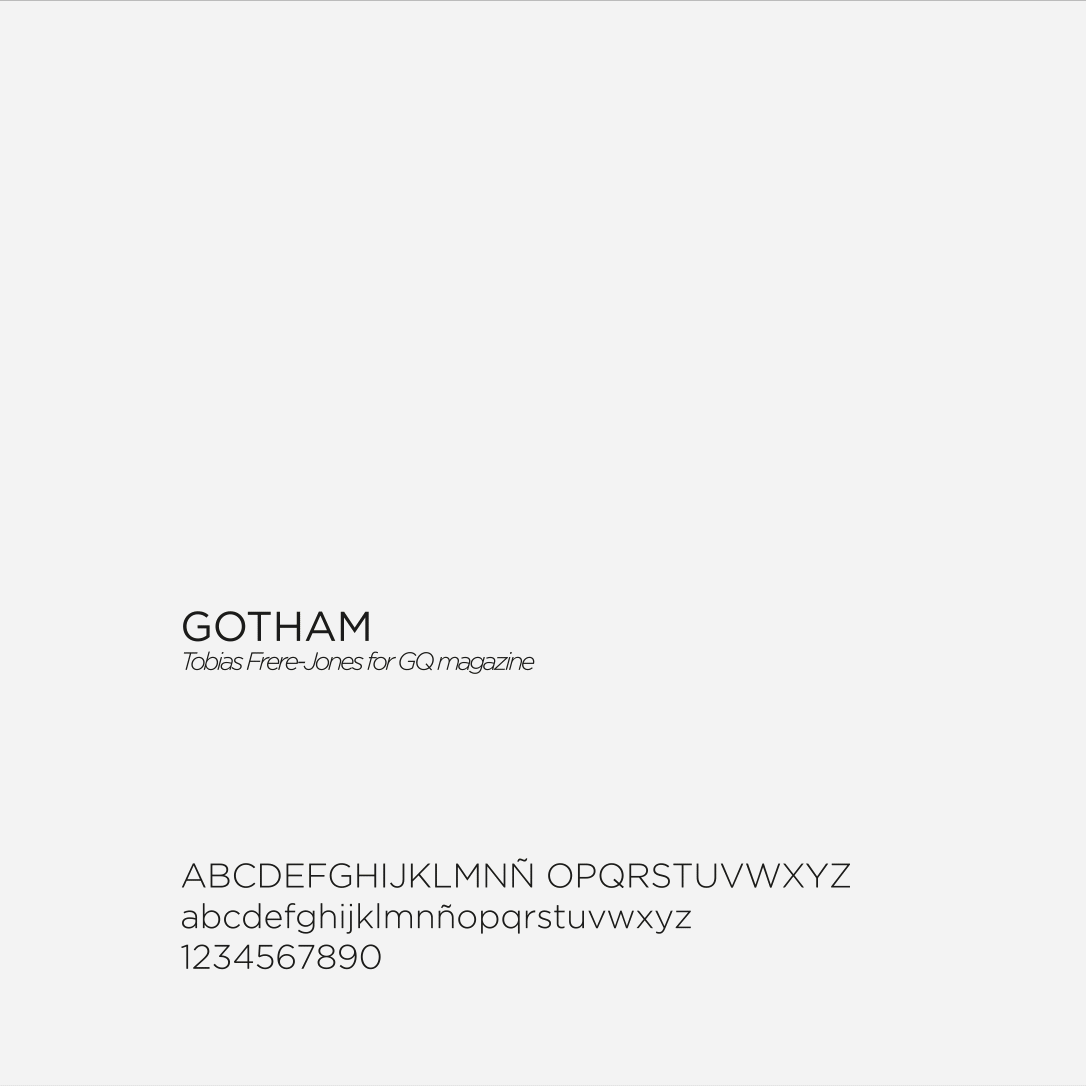
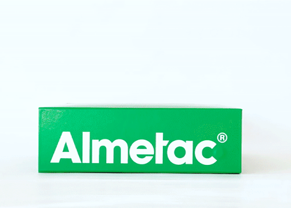
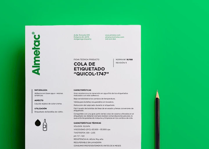
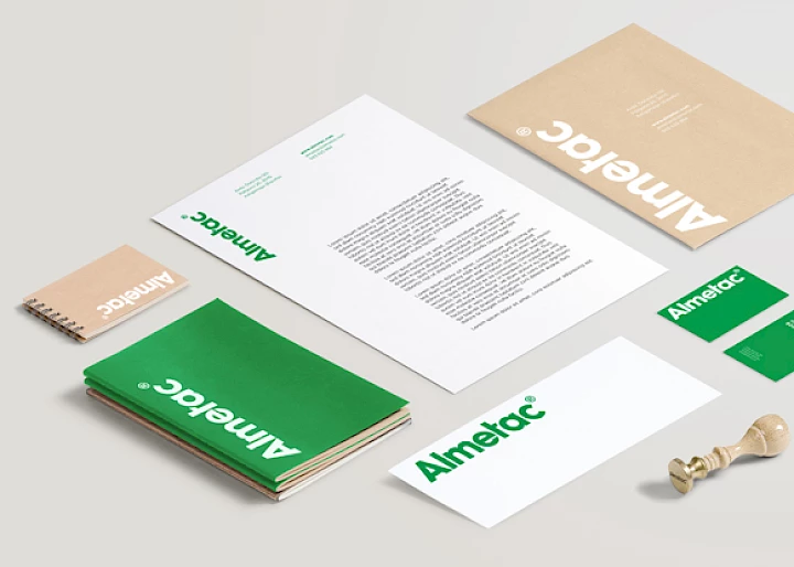
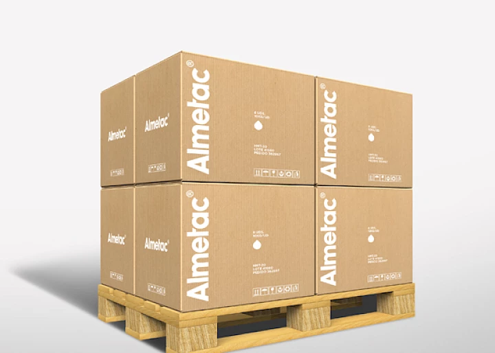
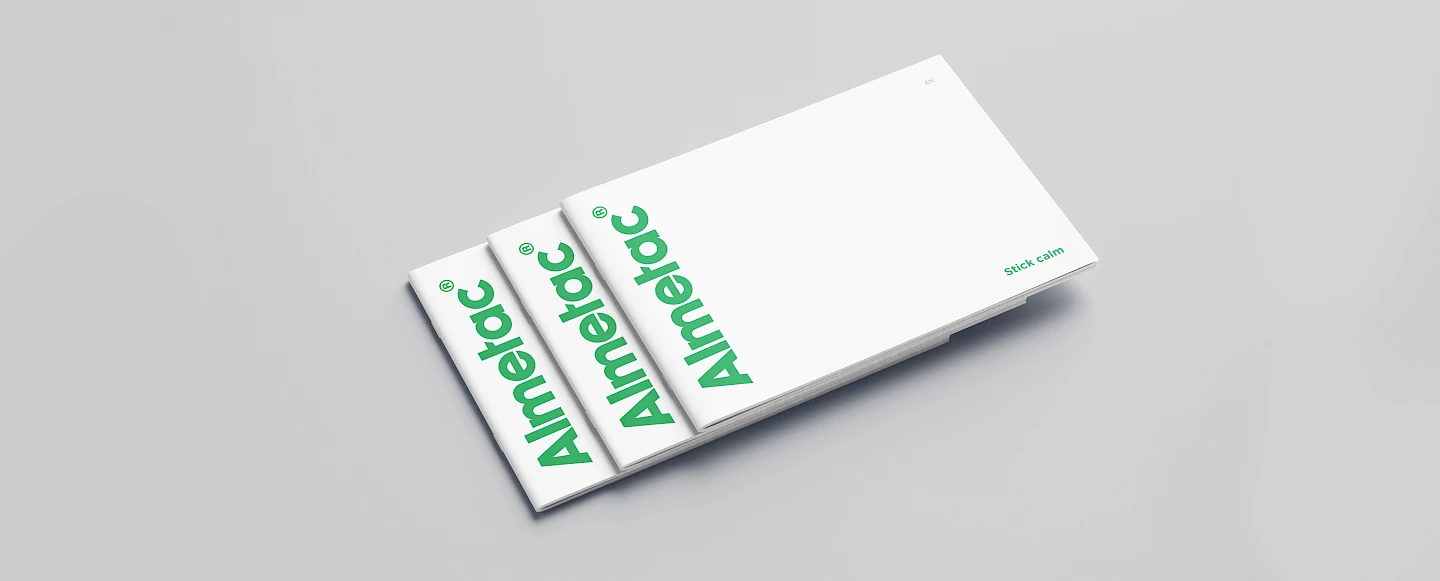
Almetac's need to project its new identity to the outside world has resulted in a rapid implementation: new corporate communication elements, such as a new catalogue and different commercial presentations; new stationery and corporate documents; renewed forms of product presentation: a differential and distinctive packaging..

A new photographic style captured in a great session to show what we do not see inside an innovative, expert and cohesive company.

almetac sesion 01 slide
02 sesion almetac slide
03 almetac sesion slide
sesion almetac 04 slide
sesion almetac slide 05
slide almetac 06 sesion
almetac 01 slide piezas
piezas 03 slide almetac
04 almetac piezas slide
slide almetac piezas 05
06 piezas slide almetac
07 piezas slide almetac

New projection in the digital sphere.

The new brand identity and personality have in the digital territory a perfect channel to develop and increase its diffusion, the further the better. Through a completely renewed website, a functional and identity tool through which to show a different way of doing things. A showcase to bear witness to a competent, competitive, modern brand, ready for any challenge. And also an instrument of proximity, service and direct contact with customers, which highlights Almetac's commitment to each and every one of them.

01 catalogo slide almetac
catalogo 02 slide almetac
slide almetac 03 catalogo
catalogo slide almetac 04

Steps towards the future

Almetac's commitment, enthusiasm and involvement in this new project show the enthusiasm and confidence of a company that is convinced of the values that make it strong in the market and of the importance of continuing to project these values through a powerful brand.