Info
branding design upv typography cabecera 01 narrative digital art culture move app

UPV/EHU

Working on the branding project for a brand such as UPV/EHU has been a professional challenge and a life experience. A project in which a pure work of personality and identity definition is mixed with the need to find new communication channels that allow an efficient, coherent and orderly management of this new brand identity both for external companies and for the University's own community.

design digital narrative move 02 culture upv branding app typography art relato art typography culture design branding narrative 01 move app relato digital upv

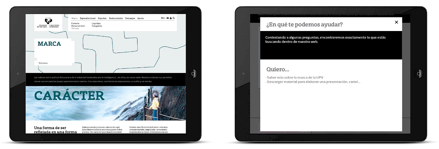
The root, the character of wanting to continue to grow.

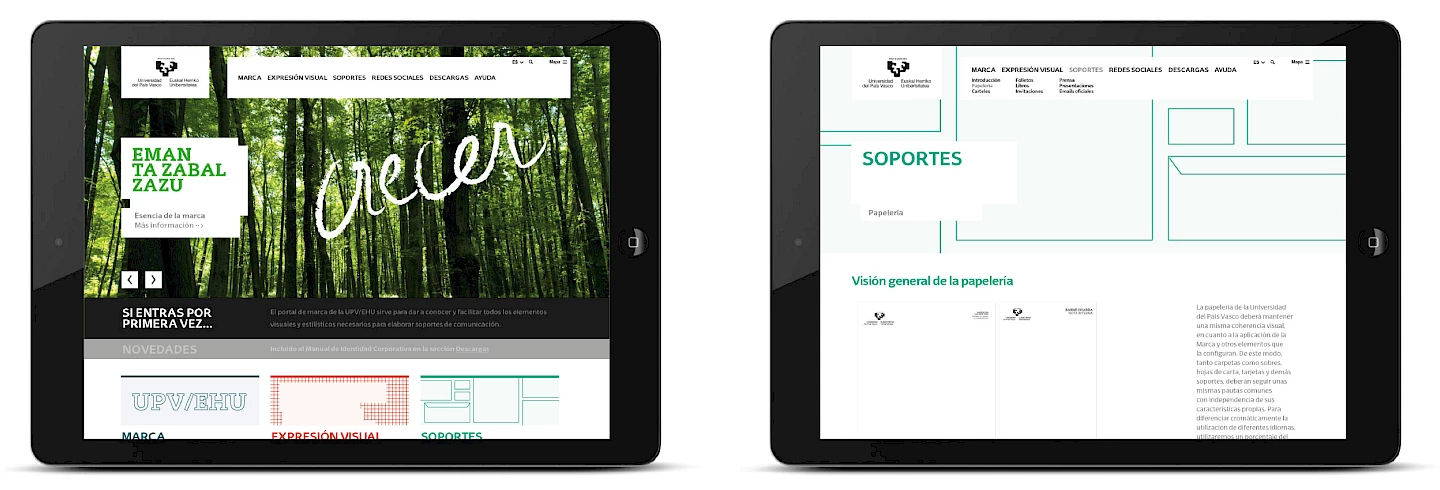
The essence of the University lies in its own slogan written in Basque, "zabal ta eman zazu", a plea to continue growing as people, as a country, as individuals and as a collective. A brand promise created from sentiment but lacking meaning in the form of a clear and defined personality. The strategic work began by establishing that personality, by defining what makes the University of the Basque Country different and unique; its way of being, its brand values.

narrative 01 culture upv process art branding move design digital typography
design digital culture art branding move narrative process typography upv 02
process 03 art branding move design culture digital narrative upv typography
04 culture move narrative design process branding digital upv art typography

Typography is the voice of the text.

The expression of a brand, in all its forms, has to reflect its values, its character, convey its difference. In a university, where knowledge is transmitted through text, this is essential. A unique and differential typography allows us to adapt the voice to each brand and ensure that all the elements have a meaning, are coherent and respond to the same brand idea. That is why the development of the EHU Type* typography in this project was an essential part of it. Today, the UPV/EHU is the first European university to have created its own complete and identifying typography.

* The UPV/EHU typeface is created by the Graphic Design and Typography research group of the Faculty of Fine Arts led by Professor Eduardo Herrera.

typography upv branding move culture 01 app narrative design art tipografia digital

Empty boxes as a visual style.

With a renewed personality and its own identity symbolised in a new corporate typography, a whole visual system has been defined where the empty boxes or, as we have redefined them, "space-boxes" will be the protagonists in transmitting what the University is like. A graphic system that, starting from the creative concept of the boxes, which give personality to all the communication pieces, explores a whole world of images, colours and graphics that make it possible to transmit the many and varied things that a University such as the UPV/EHU has to communicate.

The system is contained in several application guides so that the different external companies, as well as the internal staff who are also responsible for the design of certain communication pieces, can carry out the applications under the same criteria of use: guide of new visual style in communication supports, guide of use of social networks..

art cajas typography design graphic culture upv system vacio move branding
culture slider app digital design narrative branding move typography 01 art upv
art narrative app move branding design typography slider culture upv 02 digital
design move 03 culture art narrative digital upv app typography slider branding
design 05 app slider art narrative culture typography digital upv move branding
upv slider typography design art 2 culture move narrative branding 04 digital app
typography 06 art culture slider digital branding move upv narrative design app
1 design typography app branding digital slider art narrative upv move culture 01
culture 02 app digital slider move 1 branding design narrative typography upv art
slider 1 03 upv move typography branding art narrative app digital culture design
upv marca digital typography app culture branding art de portal move 01 narrative design
narrative branding digital portal move de typography art app marca culture design 02 upv
app 03 upv design typography move art branding digital culture portal narrative marca de

Helping to build the UPV/EHU brand.

One of the biggest challenges in this project is to ensure that the university's teaching, technical and administrative community makes correct use of the new visual style in their communications. To this end, it is essential to create tools and communication channels that allow non-experts to easily and intuitively apply the new visual style features in their communications. Under this premise, two fundamental projects have been worked on; a brand portal where you can access both strategic information and the graphic pieces of the new style and an APP so that people with no knowledge of graphic design can design posters and/or communications of the University with its new graphic and visual style in a simple and uncomplicated way.

Two unique projects that, like the typographic project, will mark a before and after in the brand management of Spanish and European universities.

design web branding app move 01 narrative upv typography digital culture art